Firebase -bash: firebase: command not found – Windows

by ,

On Windows, when trying to install Firebase with npm for the first time, you may see the error “-bash: firebase: command not found” or something similar, when you run the following command:

$ firebase login
  1. You need to make sure your npm prefix has been added to your environment variables. Run the following:
  2. $ npm get prefix

    Mine was “C:\Users\\AppData\Roaming\npm.

  3. Next, use Windows Search and search for “Environment Variables”. The System Properties dialog box will appear, with Advanced tab active. Select the Environment Variables button.
  4. Then, in the System Variables area, find the PATH variable, select it, and click Edit.
  5. The Edit Environment Variable window will show, click the New button, and then enter the path that was shown when running the command above.
  6. Finally, restart Git Bash and try running “$ firebase login” again.

When I tried running it, I received the following error: Error: Cannot run login in non-interactive mode. See login:ci to generate a token for use in non-interactive environments.

Confused by the error message, I ran the following:

$ firebase login:ci

I received the following two errors:
Error: Cannot run login:ci in non-interactive mode.
Error: An unexpected error has occurred.

Further investigation led me to this command, which helped resolve the issue:

$ firebase login --interactive

You can than proceed with the prompt below and then authenticate into your Google account

Firebase -bash: firebase: command not found – Windows

How To Change Directories In Windows Using Git Bash

by ,

This brief tutorial describes how to change directories using Git Bash for beginners. Since I am fairly new to using the command line, using tools such as npm, Node.js, and Git Bash, I figured I would describe how I figured out to change directories, when starting a new project and initializing a Git repository. While I have used version control tools such as GUI’s – GitHub for Windows, Tortoise SVN for several years, learning the command line can be pretty intimidating and confusing, so providing an easy to understand way to get started being comfortable changing directories on your machine is the goal of this article.

This guide assumes that you already have Git installed on your machine and covers a basic installation using Windows 7. This guide also assumes that you have installed Git in the default directory as set in the installation process. On Windows 7, the default directory is C:\Program Files\Git. To install Git for Windows, click on this link.

Open Git Bash in your Windows Start menu. Once open you will see the following, an empty window with a dollar sign and a flashing cursor:

How To Change Directories Using Git Bash

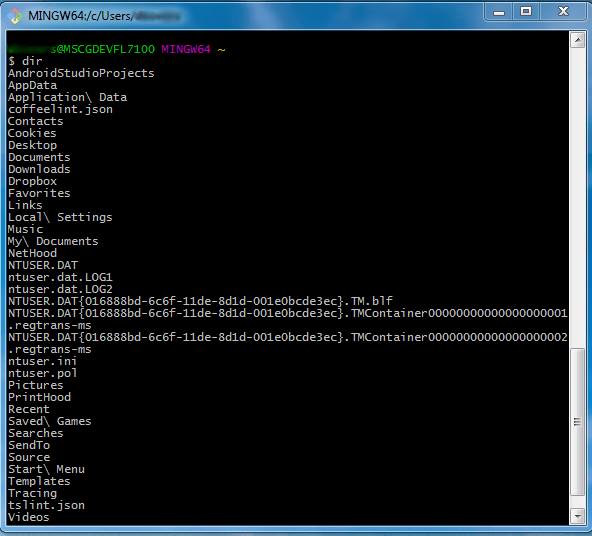
From here you can type “dir” or “ls”. “ls” is a command to list files in Unix and Unix-like operating systems. Using “dir” will list the files as shown below:

How To Change Directories Using Git Bash

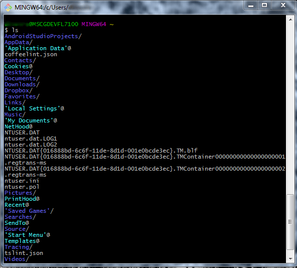
Using “ls” will list the files as shown below:

How To Change Directories Using Git Bash

By default, as shown above Git will list the files in your C:\Users\%user-profile%. You will notice that your folders are color coded. The light blue folders with the @ symbol, are folders that the current Windows account does not have access to. Folders with access are colored dark blue, with files having no color.

The first time I worked with Git Bash, I thought the command $ cd / would bring me back to the root folder, the C: drive. However, typing this in will bring you to the folder where Git is installed, C:\Program Files\Git, which is not what we may want.

How To Change Directories Using Git Bash

My new repository is located in C:\Users\%user-profile%\Documents\Git\.git. To get here, we need to type in the following $cd /c/users/&user-profile%/documents/git, as shown below.

How To Change Directories Using Git Bash

You will know you are now in a Git repository, evidenced by the (master) label after the path name in command prompt. Since this is a new repository, there are no files in my directory, so typing “ls” will show no results.

That’s it! Just an easy to follow guide for those of you who may need to find your way when dealing with a Unix command line for the first time. Enjoy!

HTML Email – Targeting Yahoo Mail browser CSS

by ,

Yahoo! mail, specifically in Firefox and Chrome, ignores your media query declaration along with all of its conditional statements. It then renders each of the styles as if they are outside of the media query to begin with. This can become problematic when you are developing emails that have a logo in your footer, and you want to position it based on desktop or mobile view. See the image below as an example:

Logo that should not appear in desktop view - Yahoo! Mail

In this situation, the logo underneath the hyperlinks should be hidden, only appearing on mobile email clients. Here is the initial HTML.

HTML

<a href="http://www.website.com" target="_blank" style="text-decoration:none;color:#ffffff;"> <img src="logo.png" alt="logo" width="116" height="31" class="show-mobile" style="display:none; border:none; border-style:none;"/> </a>

The inline style of display:none; and class=”show-mobile” are in bold. The former is intended to hide the logo under the links in desktop view, while the latter is meant to display the logo in mobile view.

Below is the source code that is generated by the Yahoo! email client.

yahoo! email html source code

Yahoo! mail will prepend the following string “yiv##########” to your inline css that is used to show the element in mobile devices, as you can see it does so with class=”show-mobile”.

Despite the fact that there is now a Yahoo! media query that will fix this bug, attribute selectors are still not supported. Using a CSS rule as shown below, will not work when trying to target the Yahoo! generated CSS class.

CSS

[class^="yiv"][class$=”show-mobile”] { display: none; }

Just for kicks, even if you explicitly create a rule for the generated class, it will still not work:

CSS

[class=”yiv0779069323show-mobile”] display:none; }

Using the Yahoo! media query will do the trick and hide the logo.

CSS

@media screen yahoo { span[class="show-mobile"] { display: none !important; } }

See the intended result below.

Logo in footer for desktop view - Yahoo! mail

Please note that I discovered that this problem only happens in Firefox and Chrome only, not in IE.

The Email on Acid website has two terrific articles on their website that were of great help when trying to solve this problem, https://www.emailonacid.com/blog/article/email-development/9_ways_to_prevent_yahoo_headaches#yahoo_tip8 and https://www.emailonacid.com/blog/article/industry-news/yahoo_mail_now_supports_media_queries.

HTML Email and Litmus – Prevent Plain Text Email Hyperlinks From Turning Blue

by ,

This article focuses on how to prevent plain text email hyperlinks from turning blue when testing email clients using an email design and marketing tool such as Litmus. This post will also be useful for situations where you want to prevent hyperlinks from turning blue.

Please see the image and HTML below for a visual. The URL has been bolded for illustrative purposes and is not part of final solution.

plain text hyperlink

HTML

<tr> <td valign="top" align="left" width="20" style="font-size: 1px; line-height: 1;">&nbsp;</td> <td valign="top" align="left" width="560" style="font-size: 14px; color:#6d6e71;">Ut sit amet consectetur justo, vel convallis ante. Phasellus at augue eu mi posuere rhoncus. Nullam quis pretium tellus. Quisque a odio vulputate lacus suscipit blandit ut vitae dolor http://www.website.com/page/document.pdf. Curabitur sed purus non ante eleifend aliquet id ut lacus. Aliquam erat volutpat. Duis tincidunt, enim nec eleifend condimentum, tellus lectus tempor felis, eu dictum magna elit ut arcu. Curabitur sodales, nisi eu lobortis consequat, ligula nulla placerat augue, ac vehicula quam arcu at ex.</td> <td valign="top" align="left" width="20" style="font-size: 1px; line-height: 1;">&nbsp;</td> </tr>

The following list of email clients will show a blue colored plain text hyperlink.

  • Apple Mail 9
  • Apple Mail 10
  • all versions of Outlook after 2003
  • Gmail App(Android)
  • Gmail App(iOS)
  • Inbox by Gmail(iOS)
  • all iPhones and iPads
  • AOL all browsers
  • Gmail all browsers

Here is what it looks like in Outlook 2016:

outlook 2016 plain text hyperlink blue

In most cases inserting a zero width joiner &#8205; or &zwj; within the plain text URL will solve the issue. Normally you would insert the zero width joiner in the www and the .com as shown here <a href="http://www.website.com/page/document.pdf">ww&zwj;w.website.co&zwj;m/page/document.pdf</a>. We normally do not precede linked text inside an anchor element with the http:// protocol, since it is only needed for the href attribute. However, for promotional emails or for references, URL’s are usually entered as plain text with the http:// preceding it.

When using plain text URLs with the http:// preceding it, placing a zero width joiner in the www and .com parts of the string will resolve the issue on email clients such as iPhone and iPads, but may yield strange results. See below:

HTML

<tr> <td valign="top" align="left" width="20" style="font-size: 1px; line-height: 1;">&nbsp;</td> <td valign="top" align="left" width="560" style="font-size: 14px; color:#6d6e71;">Ut sit amet consectetur justo, vel convallis ante. Phasellus at augue eu mi posuere rhoncus. Nullam quis pretium tellus. Quisque a odio vulputate lacus suscipit blandit ut vitae dolor http://ww&zwj;w.website.co&zwj;m/page/document.pdf. Curabitur sed purus non ante eleifend aliquet id ut lacus. Aliquam erat volutpat. Duis tincidunt, enim nec eleifend condimentum, tellus lectus tempor felis, eu dictum magna elit ut arcu. Curabitur sodales, nisi eu lobortis consequat, ligula nulla placerat augue, ac vehicula quam arcu at ex.</td> <td valign="top" align="left" width="20" style="font-size: 1px; line-height: 1;">&nbsp;</td> </tr>

Using the code above reveals a hyperlink that is partially blue in Gmail App (iOS):

Gmail-app-iOS-partially-blue-hyperlinkGmail-app-iOS-partially-blue-hyperlink-zoomed-in

The solution that seems to work for most, if not all, email clients, is to insert the zero with space joiner inside of the http://, the www, and the domain extension (.com, .net, .biz), at the very minimum. You may need to place it many locations as possible, such as after the dots, etc. By strategically placing them in certain parts of the URL string, you will avoid it appearing partially blue in some email clients. See below:

Solution

HTML

<tr> <td valign="top" align="left" width="20" style="font-size: 1px; line-height: 1;">&nbsp;</td> <td valign="top" align="left" width="560" style="font-size: 14px; color:#6d6e71;">Ut sit amet consectetur justo, vel convallis ante. Phasellus at augue eu mi posuere rhoncus. Nullam quis pretium tellus. Quisque a odio vulputate lacus suscipit blandit ut vitae dolor ht&zwj;tp://ww&zwj;w.webs&zwj;ite.&zwj;co&zwj;m/page/document.pdf. Curabitur sed purus non ante eleifend aliquet id ut lacus. Aliquam erat volutpat. Duis tincidunt, enim nec eleifend condimentum, tellus lectus tempor felis, eu dictum magna elit ut arcu. Curabitur sodales, nisi eu lobortis consequat, ligula nulla placerat augue, ac vehicula quam arcu at ex.</td> <td valign="top" align="left" width="20" style="font-size: 1px; line-height: 1;">&nbsp;</td> </tr>

Gmail-app-iOS-gray-hyperlinkGmail-app-iOS-gray-hyperlink-zoomed-in

This article may be unnecessarily long, however, as you become more experience with programming HTML emails, hacks for some issues may not resolve the worst case scenario. The worst case scenario here is that we needed to place a plain text URL, that is not hyperlinked, in a reference section of an email.

We may continue to expand on this post in the future. Hoping that this is a great help to you all!

HTML Email – Remove Whitespace and Gaps In Between Table Rows

by ,

In this post you will learn how to remove unwanted whitespace or gaps that may appear in between rows when creating an HTML Email. This usually occurs when the rows have a background color that is different from the parent table element. A program such as Litmus can be used to reveal the bug before releasing an email to your intended recipients. The following list of devices are the ones usually affected.

  • iPhone 6 iOS 8
  • iPhone 6+ iOS 8
  • iPhone 6 iOS 9
  • iPhone 6+ iOS 9
  • iPhone 7 iOS 10.2
  • iPhone 7+ iOS 10.2
  • Android 5.1
  • Android 6.0

Our initial HTML consists of a parent <table> element, which is used for viewing our emails in a browser. An inner <table> element is used to contain and center the email in a desktop browser. The remainder of the code consists of three table rows with a yellow background color. The first and third rows are spacers that are each 25 pixels in height, while the middle row contains the line of text.

HTML

<!-- outer wrapper for displaying email in browser --> <table width="100%" cellpadding="0" cellspacing="0" border="0" bgcolor="#ffffff"> <tr> <td align="center" valign="top"> <!-- inner wrapper that contains email --> <table align="center" width="600" cellpadding="0" cellspacing="0" border="0" bgcolor="#ffffff"> <tr> <td colspan="3" bgcolor="#f5b21e" align="left" height="25" style="font-size: 1px;"> </td> </tr> <tr> <td colspan="3" bgcolor="#f5b21e" align="center" valign="middle" height="25" style="font-size: 24px;font-weight:bold;font-family: Arial, Helvetica, sans-serif;color:#00008B;">Hello world!</td> </tr> <tr> <td colspan="3" bgcolor="#f5b21e" align="left" height="25" style="font-size: 1px;"> </td> </tr> </table> </td> </tr> </table>

This is an image showing the gaps between each of the rows.

whitespace gaps between table rows html email

As you can see, the white background of the containing table bleeds through the gaps, showing what appears to be two faint white lines. Surrounding these three <tr>‘s with a table that has a yellow background will do the trick. See the updated HTML below, with our changes bolded.

Solution

HTML

<!-- outer wrapper for displaying email in browser --> <table width="100%" cellpadding="0" cellspacing="0" border="0" bgcolor="#ffffff"> <tr> <td align="center" valign="top"> <!-- inner wrapper that contains email --> <table align="center" width="600" cellpadding="0" cellspacing="0" border="0" bgcolor="#ffffff"> <tr> <td colspan="3" align="left"> <table cellspacing="0" cellpadding="0" border="0" width="100%" bgcolor="#f5b21e"> <tr> <td bgcolor="#f5b21e" align="left" height="25" style="font-size: 1px;"> </td> </tr> <tr> <td bgcolor="#f5b21e" align="center" valign="middle" height="25" style="font-size: 24px;font-weight:bold;font-family: Arial, Helvetica, sans-serif;color:#6a2875;">Hello world!</td> </tr> <tr> <td bgcolor="#f5b21e" align="left" height="25" style="font-size: 1px;"> </td> </tr> </table> </td> </tr> </table> </td> </tr> </table>

Prevent HTML Email from Changing Font Color for Phone Numbers

by ,

When creating HTML emails, certain HTML email clients change the font colors for phone numbers to blue, especially if they are not styled with inline CSS or are placed inside of an anchor element with an href=”tel:” attribute. You can see an example in the image below:

prevent html email from changing font color for phone numbers

The following list of email clients will be affected as a result:

  • iPhone 5s iOS 7
  • iPhone 5s iOS 8
  • iPhone 6 iOS 8
  • iPhone 6+ iOS 8
  • iPhone 6 iOS 9
  • iPhone 6+ iOS 9
  • iPhone 7 iOS 10.2
  • iPhone 7+ iOS 10.2
  • iPad (retina) iOS 10.2
  • iPad Mini iOS 10.2
  • iPad Pro (12.9 inch) iOS 10.2
  • Gmail IE
  • Gmail Firefox
  • Gmail Chrome

Below, I will explain several methods that I have seen recommended based on research.

HTML – Solution One(iPhone 5, iPhone 5s, iPhone 6 and iPhone 6s only)

Use <meta name=”format-detection” content=”telephone=no”> in your HTML header. This will resolve the issue on only the older iPhones (iPhone 5, iPhone 5s, iPhone 6 and iPhone 6s, all versions of iOS).

HTML – Solution Two(Gmail only)

Surround your hyphens with <span> elements. This will only fix the issues in Gmail (IE, Firefox and Chrome).

1<span>-</span>800<span>-</span>888<span>-</span>8888

Using the HTML entity for hyphens, &#45; renders the same result as above example.

1<span>&#45;</span>800<span>&#45;</span>888<span>&#45;</span>8888

HTML – Solution Three(All Clients)

This is considered the ultimate solution and will work for all clients. Insert a zero width joiner &zwj; in at least two or three different spots in the phone number.

1-8&zwj;00-8&zwj;88-8&zwj;888

IE 11 – Word Wrap or Word Break not working for Long Word or Overflowing Text

by ,

If you are attempting to wrap very long words or hyperlinks within a narrow container, you may experience text overflowing when viewing your results in IE11. This may happen despite using the CSS declaration word-wrap: break-word; in IE 11, but looks fine in other browsers. See below:

word wrap or break overflowing width of container

There are ways of handling long words and URLs using forced breaks, hyphenation, ellipsis, etc). See the terrific article here on the CSS Tricks website: https://css-tricks.com/snippets/css/prevent-long-urls-from-breaking-out-of-container/

What if you do not want a hyphen or ellipsis to appear? Using word-wrap: break-word; overflow-wrap: break-word; word-break: break-all; word-break: break-word; or even the Microsoft CSS Browser Prefix declaration -ms-word-break: break-all;, may not work. It didn’t for me.

The solution, using the HTML, ZERO-WIDTH-SPACE Unicode Character &#8203;.

CSS

#container { width: 120px; background-color:#ccc; border: 1px solid #aaa; margin: 50px 50px 0; } .break { word-wrap: break-word; }

HTML

<div id="container"> <p>Donec sit amet erat porta, rhoncus dolor nec, <span class="break">scelerisqueaghtr&#8203;afdssf</span> accumsan leo. Phasellus eu ipsum aliquam, <a class="break" href="www.samplewebsite.com/reallylongurl">www.reallylong&#8203;websiteurl&#8203;.com/reallylongurl</a> rutrum orci a, pulvinar elit. Aenean auctor dignissim tempus.</p> </div>

You have to insert the unicode character whereever you want the breaks to occur. See the final result below.

word wrap or break in IE 11 with zero space unicode character

Google Chrome – Uncaught Security Error: Failed to read the ‘contentDocument’ property from ‘HTMLIFrameElement’

by ,

When trying to access an iframe element’s window and document properties from a parent page in Google Chrome, you may get the following Uncaught Security Error in the Developer Tools Console:

Uncaught SecurityError when accessing iframe element

This happens because all of the modern browsers, except Chrome support both the iframereference.contentWindow and iframereference.contentDocument properities, only if the iframe is on the same domain as the parent page containing the frame. To include Chrome use the following JavaScript code:

JAVASCRIPT

var content = iframe1.contentDocument || iframe1.contentWindow.document; var elementID = content.getElementById('elementInsideIFrame');

If you open the parent document file locally in Chrome without using a web server, the code above will not work. This is a great piece of code to use when you want toggle a window or iframe to expand such as in an animated banner.

Prevent anchor elements from turning purple after clicking in HTML emails

by ,

If you test HTML email campaigns using real devices, then this post may be beneficial to you. In Outlook 2010 for example, hyperlinks in their visited state, may turn purple after you click on them, even if you explicitly declare an inline CSS color style in a <span> element. You wouldn’t be able to detect this if you are using a email testing software such as Litmus. Here is the initial HTML:

HTML

<table> <tr> <td colspan="4" color="#ff6b35"> <a style="color:#ff6b35;text-decoration:none;" href="#">Privacy Notice</a> <a style="color:#ff6b35;text-decoration:none;" href="#">Unsubscribe</a> <a style="color:#ff6b35;text-decoration:none;" href="#">Terms of Use</a> <a style="color:#ff6b35;text-decoration:none;" href="#">Legal Notice</a> </td> </tr> </table>

Here are the hyperlinks in their initial (:linked) state:

html email hyperlinks linked

Here are the hyperlinks after clicking on the “Unsubscribe” hyperlink (:visited) state – MS Outlook 2010

html email hyperlinks visited

The initial thought may be to surround the text inside the anchor element with a <span>, and using the same color specified in the anchor element. See the updated HTML below:

HTML

<table> <tr> <td colspan="4" color="#ff6b35"> <a style="color:#ff6b35;text-decoration:none;" href="#"><span style="color:#ff6b35;">Privacy Notice</span></a> <a style="color:#ff6b35;text-decoration:none;" href="#"><span style="color:#ff6b35;">Unsubscribe</span></a> <a style="color:#ff6b35;text-decoration:none;" href="#"><span style="color:#ff6b35;">Terms of Use</span></a> <a style="color:#ff6b35;text-decoration:none;" href="#"><span style="color:#ff6b35;">Legal Notice</span></a> </td> </tr> </table>

After testing the email again in Outlook 2010, the links still turn people, despite the code changes above. After experimenting a little bit more, we found our solution. You have to surround the text with a <strong> element.

Solution

HTML

<table> <tr> <td colspan="4" color="#ff6b35"> <a style="color:#ff6b35;text-decoration:none;" href="#"><strong style="color:#ff6b35;">Privacy Notice</strong></a> <a style="color:#ff6b35;text-decoration:none;" href="#"><strong style="color:#ff6b35;">Unsubscribe</strong></a> <a style="color:#ff6b35;text-decoration:none;" href="#"><strong style="color:#ff6b35;">Terms of Use</strong></a> <a style="color:#ff6b35;text-decoration:none;" href="#"><strong style="color:#ff6b35;">Legal Notice</strong></a> </td> </tr> </table>

Using the <strong> element works, but there is a side effect. The text is now bold. To address this, simply add an inline style of style=”font-weight: normal;” to your <strong> element and that should do the trick!

Links remain in :hover state after clicking browser Back button on mobile devices

by ,

When using Mobile Safari (iOS) on iPads and iPhones or Chrome Mobile on Android devices, when you touch a button or hyperlink, it will trigger the “hover” state. If you have a CSS declaration that targets this pseudo class, this style may be active or visible if you tap the button/hyperlink and then tap the Back button in the browser. This is most likely not the desired state that you are looking for especially if your :hover declaration was intended for desktop browsers only. The reason why this happens is because when you tap on the back button, a request to the server is not sent, therefore the page that is in the cache gets reloaded along with the unintended hover state applied to your button or hyperlink.

Below is the sample HTML and CSS:

HTML

<a href="#" id="button">Button 1</a>

CSS

a { display: inline-block; width: 200px; font-size: 1em; font-weight: bold; border-radius: 5px; text-align: center; margin-bottom: 25px; line-height: 2em; text-decoration: none; } a:link, a:no-touch:hover { background-color: green; color: white; } a:hover { background-color: white; color: green; border: 1px solid green; }

Here are our buttons in the linked and hover states, respectively.

buttons_post5

When tapping on the Back button on a mobile browser, the button with white background with green font would be active and not the button with green background and white font.

Solution

To fix this you can set up a script to detect the device using the ID of the button and the userAgent.match function, by passing Android, iPhone, or iPad arguments as seen below.

JavaScript

<script> var userAgent = window.navigator.userAgent; if (userAgent.match(/iPad/i) || userAgent.match(/iPhone/i) || userAgent(/Android/i)) { var button1 = document.getElementByID("button"); button1.className += " no-touch"; } </script>

This script adds a “no-touch” class to the className property of the anchor tag, which will then render as if the button is in it’s “linked” state. For more information on how to check User Agents for Mobile/Tablet, visit this post on stackoverflow, JavaScript how to check User Agent for Mobile/Tablet.